Usability Heuristics evaluation
& Redesign concept
Role
Student design sprint project for BrainStation UX Design Bootcamp
Tools
Figma
Team
Cecilia Cao
Marmara El Masri
Walmart
Walmart Inc. is an American multinational retail corporation that operates a chain of hypermarkets, discount department stores, and grocery stores. They find value in creating a seamless shopping experience, which includes a mobile ecommerce app to provide customers a way to save time and money.
Values
Respect, service, excellence, and integrity.
What is a Heuristics evaluation?
A heuristic evaluation is a method for finding usability problems in a user interface design. They involve having a small set of evaluators examine the interface and judge its compliance with recognized usability principles (the “heuristics”).
The 10 Usability Heuristics:
Severity Ratings for Heuristic Issues
Severity ratings can be used to allocate the most resources to fix the most serious problems and can also provide a rough estimate of the need for additional usability efforts.
These ratings are a combination of three factors: frequency, impact, and persistence of the problem. Based on the severity of the usability problem, a number is assigned to each evaluated heuristic, using a 0 to 4 rating scale.
Users are currently left confused.
The problem with the current Walmart app is that users are left feeling confused about certain buttons and how to navigate, and are having a difficult time trying to find what they are looking for.
User journey.
To gain a more genuine perspective of the problem, we put ourselves into the shoe of Walmart shoppers by going through a common experience - buying something!
The goal here was to evaluate each screen we come across when going through the user journey. This resulted with us observing multiple violated heuristics in each screen.
Evaluated Heuristics.
Flexibility and efficiency of use
Aesthetic and minimalist design
Match between system and the real world
Usability Violations
Match between system and the real world
Consistency and standards
Aesthetic and minimalist design
Usability Violations
Aesthetic and minimalist design
Consistency and standards
Recognition rather than recall
Usability Violations
Aesthetic and minimalist design
Visibility of system status
Usability Violations
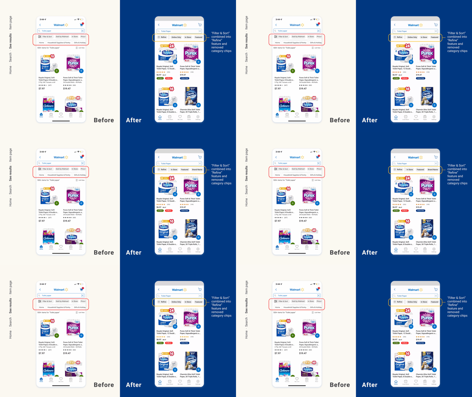
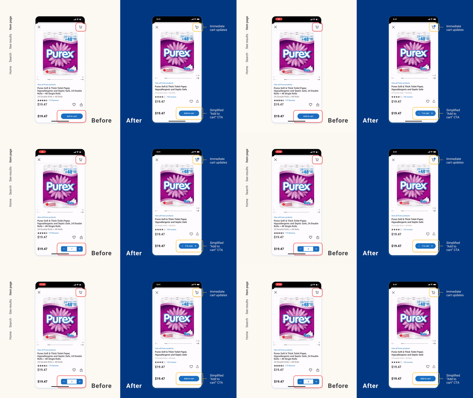
Screen redesigns.
Based on the insights and findings we took from the evaluation, we then were able to come up with redesigned solutions.


